
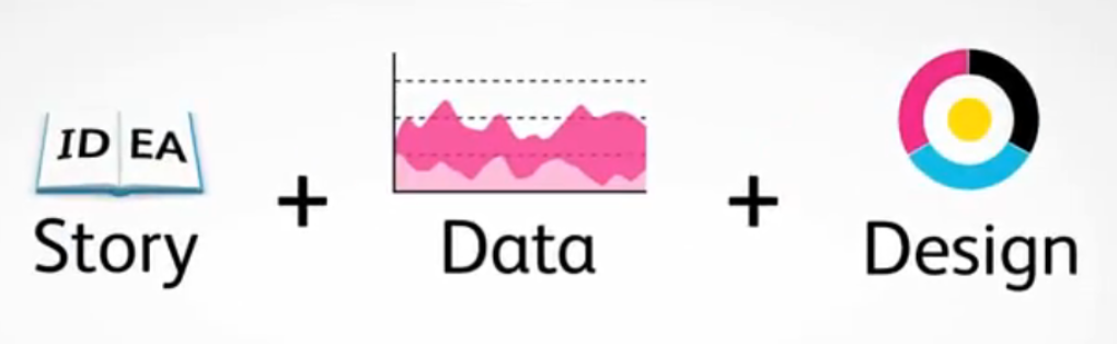
Infographics have made quite a splash in the marketing world over the past year or so and with good reason. If you are unfamiliar, infographics are essentially graphic representations of information and data. These visualizations allow viewers to process complex subject matters much more easily with a quick snapshot of information. I recently stumbled across this great example of an infographic depicting the “State of B2B Social Media Marketing,” which helps paint a clearer picture of how graphic representations of information are currently being used.
Infographics can be easily incorporated into your content marketing strategy to help you better communicate with your audience, especially when it comes to blogging, writing white papers and sharing information through social media. Like any representation of your company and/or brand message, the content you share through infographics should provide value to your target audience and should have visual appeal that is both eye-catching and professional.
With marketing there is usually no shortage of data and statistics to make sense of, so when I started seeing infographics popping up, my concern was not where I’d get the content, but rather how I would make something as visually attractive as the examples I had seen. Enter Visual.ly. Visual.ly is startup site that allows you to both find and create infographics using all types of information from the Web.
Two main features of the site:
(1.) It serves as a database of existing infographics from the Web. After signing up for free you can search the database of over 3,000 (approaching 4,000) infographics. Search by topic to find infographics that interest you. If you find something worth sharing, you can post to your social media sites right from Visual.ly or imbed it into your own Web site to help communicate your own story.
(2.) This feature is still in beta mode, but will eventually allow you to create your own infographics –no graphic design knowledge needed. This will allow users to create beautiful and informative data visualizations in a matter of minutes! I’m eager for the arrival of this feature, but in the meantime you can test out some of Visual.ly’s capabilities with their “Twitter Visualizer” which enables you to generate a visual representation of your Twitter persona and stats based on what you Tweet, how often, and who follows you. Check out our Marketri infographic here.
How are you using infographics and what are your favorite tools for creating them? We would love to hear!