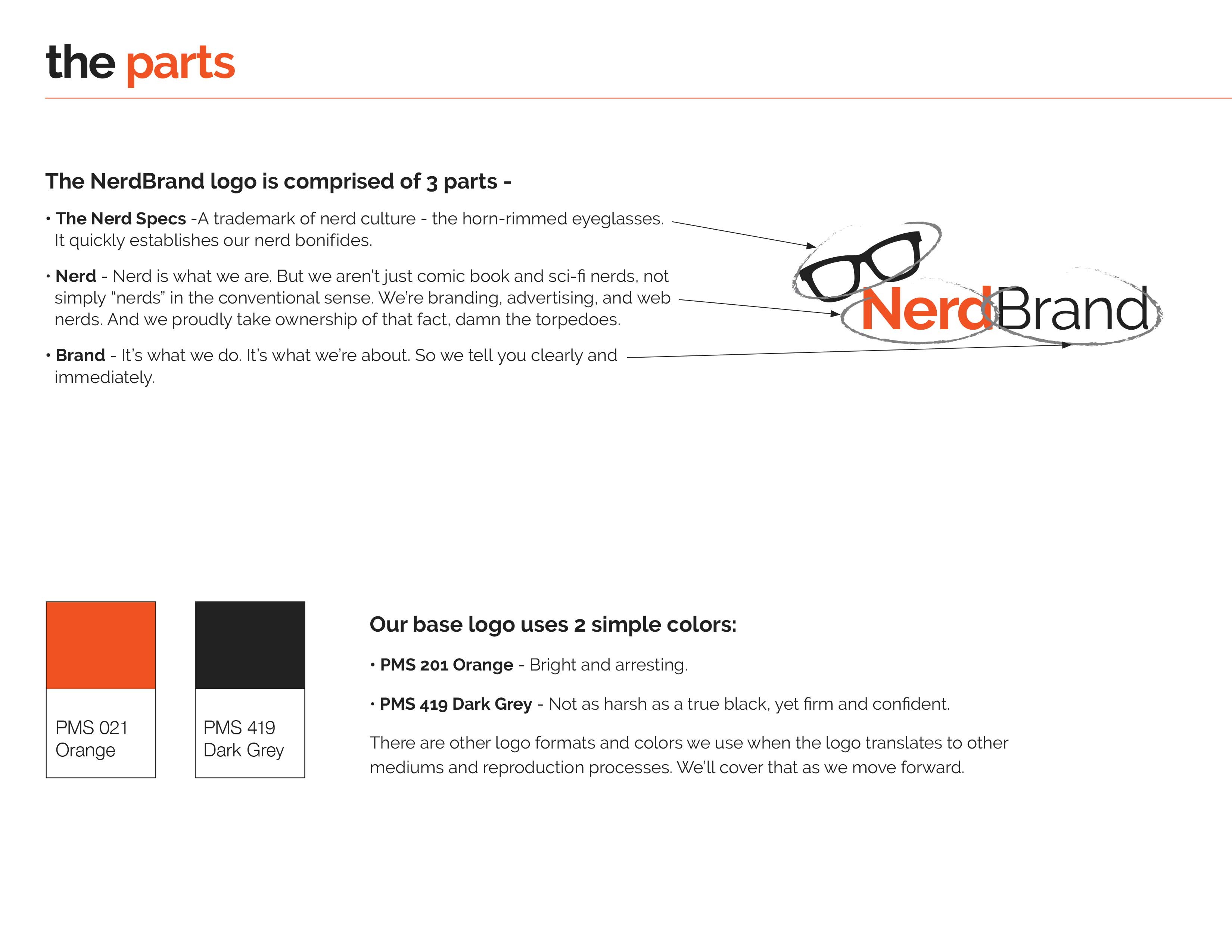
Brand guides define the proper use of your logo, color, and tone of your brands message in both print and digital mediums.
But one thing that never deviants are color swatches. If you are not starting with a Pantone, then you may have a color code selection based purely in digital.

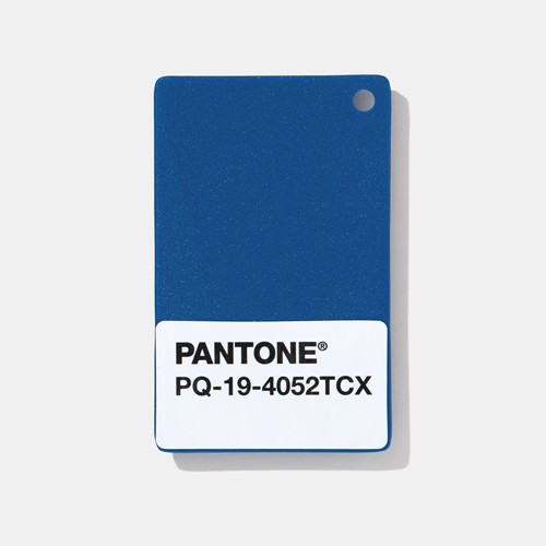
Pantone Color of the year for 2020
Control over your marketing message
This is primarily to avoid bad PR or misrepresentation of your brand. Words are powerful, and how they are used online and offline matter in advertising.
Here at NerdBrand, Mitch will tell you,
“Everything you do is an ad.”
Mitch’s Axiom number 232
If you are not considering your brands message, then ask, how are you different from others businesses like yours?
What your audience remembers about you is critical. Everyone is looking and reading, do not think they are not reading.
I have visual data showing people still read what is on a website. I would love to run this technology on your site, and show you what your audience is reading on yours.
That’s data-driven Branding.
Proper color correction
Colors don’t turn out the same for all online and offline marketing collateral.
Color is not purely digital and will never be defined first by digital due to several reasons from device, technology used (Adobe vs Sketch), and many other factors.
Therefore, when you print, or take your brand colors outside of digital, you’ll find it will not be consistent without starting somewhere. But only if your brand guide is of good quality. As well as your designer starting with the best.
Color on websites depends on the devices and screen quality. Print depends on the material, printer, and quality of the ink.
“Pantone is the industry standard,” Michele Outland, creative director of Gather Journal, says. “It’s something that I automatically go to when I need to choose a color. It prints really accurately.”
Michele Outland
Gather, which has earned six Society of Publication Designers gold medals as well as a James Beard award (source).
Without proper baselines set on color, you cannot get coffee cups to match your red that is in your logo.
Color matching is important. So choose your color match system carefully.
PANTONE 19-4052 Classic Blue color of the year for 2020
Proper logo representation
Appearance of your logo on sponsored, or cosponsored, events both printed and digital assets.
Logo use is important for Brand to help make sure they are clearing shown next to other logos. Imagine you are sponsoring an event, only to find someone has recolored your logo to match theirs.
Worse yet, they place your logo so small, that it’s unrecognizable next to the rest on a webpage or banner at an event.
Brand Guides define how your logo is used and displayed at these events. With a proper guide, any designer, or print house, should be able to use the files your brand guide has.
